Vehicle Valuations in a Crazy Used Car Market
In this post we use the CIS Automotive API to discover and compare trends in used car pricing over several years. Specifically we'll be looking at the significant changes in vehicle valuations in late 2020 and 2021 where the typical inverse relationship between price and mileage no longer held true as COVID-19 continued to impact supply chains and inflation accelerated.
In one extreme case we discover how the market would have allowed someone to daily drive their car for nearly four years and end up with a higher priced vehicle.
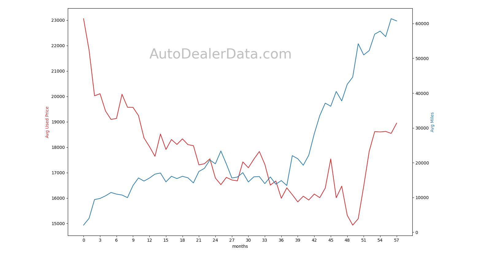
Texas, Jan 2017 - Oct 2021
A Dynamic Market
We used our /valuation endpoint to pull historical market data for used 2017 Camrys in Texas from January 2017 to October 2021 to create the above graph. We're able to significantly speed up our analysis by using this endpoint instead of pulling every listing as shown in previous posts. The same endpoint can also be used to just determine current market values.
We can see the expected inverse relationship between the ask price (Red) and the mileage (Blue) holds pretty well between months 0 (Jan 2017) to 41 (May 2020). Even though COVID-19 lockdowns started in the US in March 2020 it took a few months before shutdowns significantly disrupted prices.
Since we used a VIN from a 2017 Camry we can see lease returns raising the average mileage between month 21 and 26 (Oct 2018 - March 2019) and after month 36 (Jan 2020). While the price dropped around month 24 (Jan 2019) as mileage values increased, the price spiked very dramatically in month 45 (Oct 2020) despite high mileage values. At this point the pricing became erratic with a drop to about $15k on average in month 49 (Feb 2021, avg mileage ~45k) before spiking to $17.8k and $18.6k in months 52 and 53 (May, June 2021). At the same time pricing became erratic average mileage continued to climb from 45k miles in Feb 2021 to 52k and 57k miles in May and June 2021. Ignoring inflation, the last time these Camrys were worth similar amounts was December 2017 when average mileage was only 14.7k.
In other words, someone could have bought a used 2017 Camry in December 2017 with 15k miles on it for $18.3k, drove it 12k miles a year, and then sold it in June 2021 for pretty close to what they paid for it originally. If they waited to sell until October 2021 they could have driven an extra 3.7k miles and sold it for about $600 more than what it cost them almost four years earlier.
However, when adjusting for inflation the October sale is at a net loss of 7.6% since there is a cumulative 12% inflation over that time period. The same sale in June would have been a net loss of 7.5% after adjusting for inflation.
We also went back and checked the valuation for similar new 2017 Camrys in January 2017 to get another point of comparison. The average new price then was $24.1k compared to the Oct 2021 average used price of $18,947 (60.7k miles) is a 21.4% drop ignoring inflation and a 31% drop adjusting for inflation.
Example Code
from cisapi import CisApi
from datetime import date, timedelta
from dateutil.relativedelta import relativedelta

import matplotlib.pyplot as plt
import pandas as pd
import numpy as np

api=CisApi()

regionName="REGION_STATE_TX"
startDate=date.fromisoformat("2017-01-01")
endDate=date.fromisoformat("2021-10-01")
currentDate=startDate

# A 2017 Toyota Camry
vin="4T1BF1FK6HU436910"

histStats=[]
#loop through months and get valuation data
while(currentDate<=endDate):
    nextDate=currentDate+relativedelta(months=1)
    res=api.valuation(vin=vin, regionName=regionName,
                      startDate=currentDate, endDate=nextDate,
                      newCars=False, sameYear=True)
    data=res["data"]
    histStats.append(data)
    currentDate=nextDate

df=pd.DataFrame(histStats)

#make and show the graph
color = 'tab:red'
fig, ax1 = plt.subplots()
ax1.set_xlabel('months')
ax1.set_ylabel('Avg Used Price', color=color)
plt.plot(df["usedSaleAvg"], color=color)

color='tab:blue'
ax2 = ax1.twinx()
ax2.set_ylabel("Avg Miles", color=color)
plt.plot(df["milesAvg"], color=color)
plt.xticks(np.arange(0, 57+1, 3.0))

fig.tight_layout()
plt.show()
Conclusion
We can perform similar analysis on arbitrary vehicles and geographies going back to early 2016, by pulling from our database of over 725 million vehicles. When we're able to look at the very big picture we can find suprising results, but it's hard to beat discovering a way someone could have gotten paid to just daily drive their car.
If you'd like to extend our demo code to perform analysis on other models, dealers and brands, you can sign up here. While our API provides convenient bindings for our data, you can easilly super charge your analysis with a sql datadump so feel free to contact us about our enterprise options.